The Psychology of Colour: Refreshing Your Brand Colour Palette for Spring

Colour is more than just aesthetics — it’s a powerful psychological tool influencing perception, emotion, and brand recognition. With spring symbolising renewal, energy, and growth, now is the perfect time to refresh your brand’s colour palette and harness the power of colour psychology to better connect with your audience.
Here’s how colour influences the perception of your brand.
Why Colour Matters in Branding
The right colours evoke emotions that shape how people perceive and interact with your brand.
Here’s how different colours influence consumer behaviour:
- Blue – Trust, professionalism, and stability (popular with corporate brands)
- Green – Growth, sustainability, and health (ideal for eco-friendly or wellness brands)
- Yellow – Positivity, energy, and optimism (great for friendly, approachable brands)
- Pink – Playfulness, creativity, and warmth (often used in beauty or lifestyle industries)
- Purple – Luxury, sophistication, and creativity (commonly used by premium brands)

How to Refresh Your Brand Palette for Spring
- Assess Your Current Brand Colours – Are they aligned with your brand’s values and audience expectations?
- Use a New Colour Suite – Fully overhaul the colours you use, whether choosing a new palette or simplifying the colours in your logo to work with your palette.
- Colour Code Certain Services – Have you introduced a new service or product to your business? Make it stand out by assigning it a colour from your palette. We practice what we preach! Have you ever noticed that the key areas of Refined’s Approach – Brand Identity, Brand Strategy, and Brand Innovate – to branding each have their own colour?
- Test Audience Reactions – Run A/B tests on different colour palettes to see what resonates most with your customers.
- Create a Secondary Colour Palette – Consider adding additional colours to complement your main colour palette.
- Streamline Your Palette – Simplify! Ensure your brandmark is legible both digitally and in print by reducing the number of colours used or opting for a tonal range of colours.
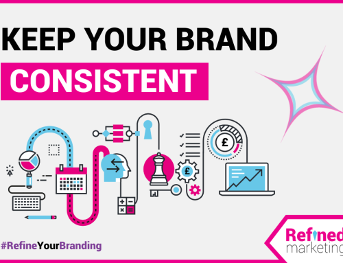
How to Keep Your Brand Palette Consistent
- Develop a Brand Guide – Include specific colour codes (HEX, CMYK, and RGB) for both digital and print use across all platforms.
- Use Tints, Tones, and Shades – Create variations of your main colours to add depth, enabling flexibility without losing consistency.
- Conduct Regular Audits – Annually review your marketing materials to ensure consistent colour usage across all touchpoints.
Summary
Refreshing your brand’s colour palette isn’t about changing your identity – it’s about enhancing your visual impact in a way that keeps your audience engaged. Whether you make subtle seasonal shifts or a bold rebrand, embracing colour psychology can elevate your brand’s presence and create stronger emotional connections.
Looking for expert advice on refining your brand’s visuals? Let’s chat about brand strategy that makes your brand outshine!
Do you need help refining your brand identity?
Let Refined Marketing help you shine – get in touch with our team to see how we can help at letstalk@refinedmarketing.co.uk

Do you want insightful blogs, free resources and curated spotlights on the industry straight to your inbox?
Sign up for The Brand Spark, our free bi-monthly newsletter packed full of insights from the world of brand marketing.


Leave a Reply